Rescorp
Redefining cleanliness in living and working spaces

The Client
Project Scope
Founded in 2013, RESCORP began as a general cleaning service that has since honed its expertise in upholstered furniture cleaning. Passionate about delivering cleanliness that clients can both see and feel, RESCORP has been at the forefront of setting standards in upholstery care—leaving furnishings clean with an extended lifespan. The firm is fully compliant with all statutory requirements and is committed to empowering its cleaning specialists with the latest technology, ensuring they deliver exceptional service.
RESCORP has always been dedicated to providing a seamless and unobtrusive experience, allowing clients in residential and corporate spaces to enjoy their lives and do their best work in a pristine environment.
Brand Strategy
→ Brand Purpose, Principles
→ Customer Segment, Acquisition and Journey
→ Positioning and Differentiation
Brand Identity
→ Logo, Colors, Fonts
→ Style Guidelines
Brand Implementation
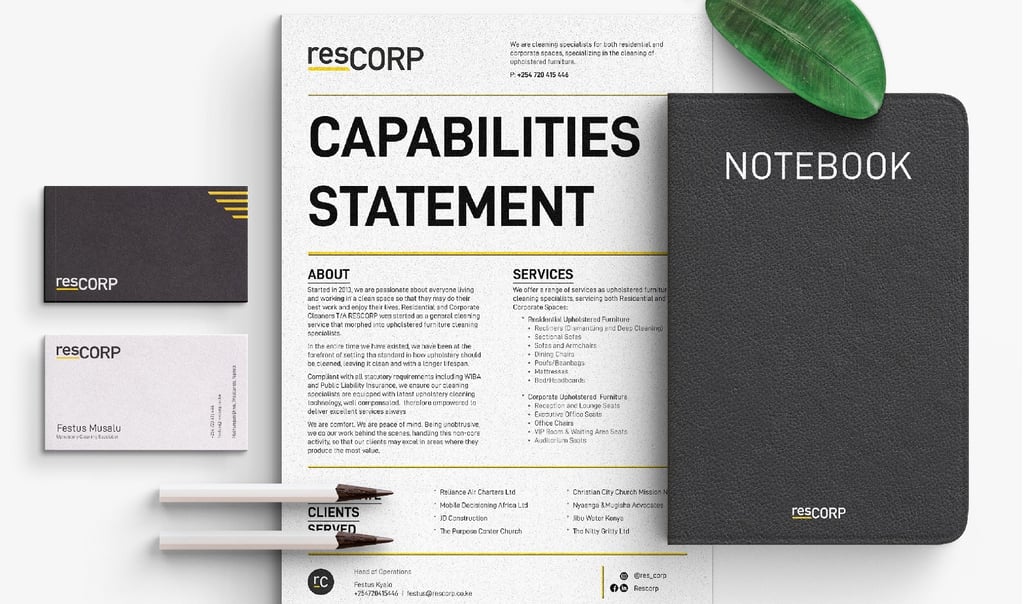
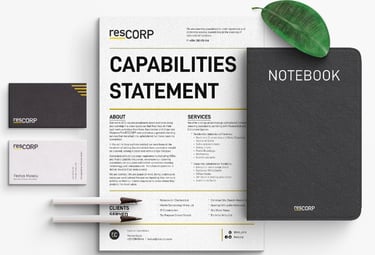
→ Capabilities Deck
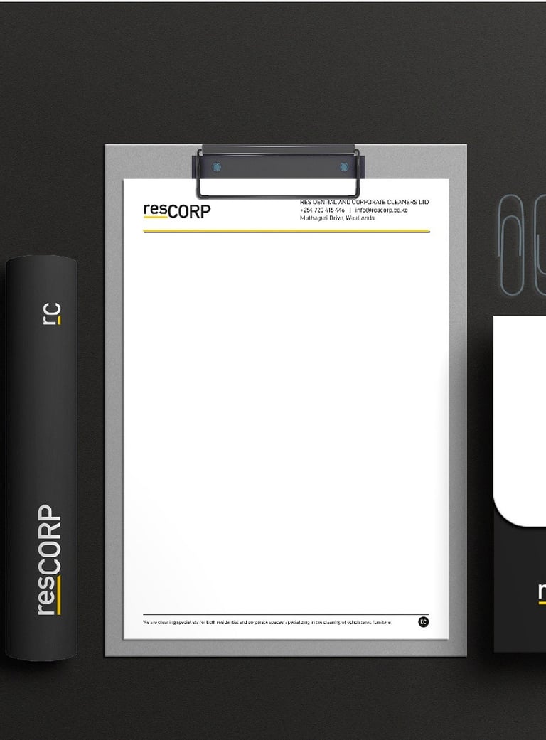
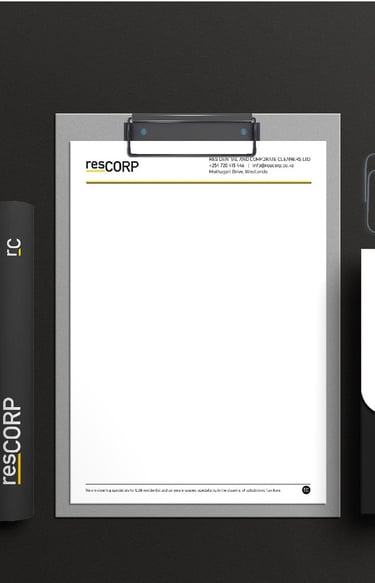
→ Letterhead
→ Business Cards
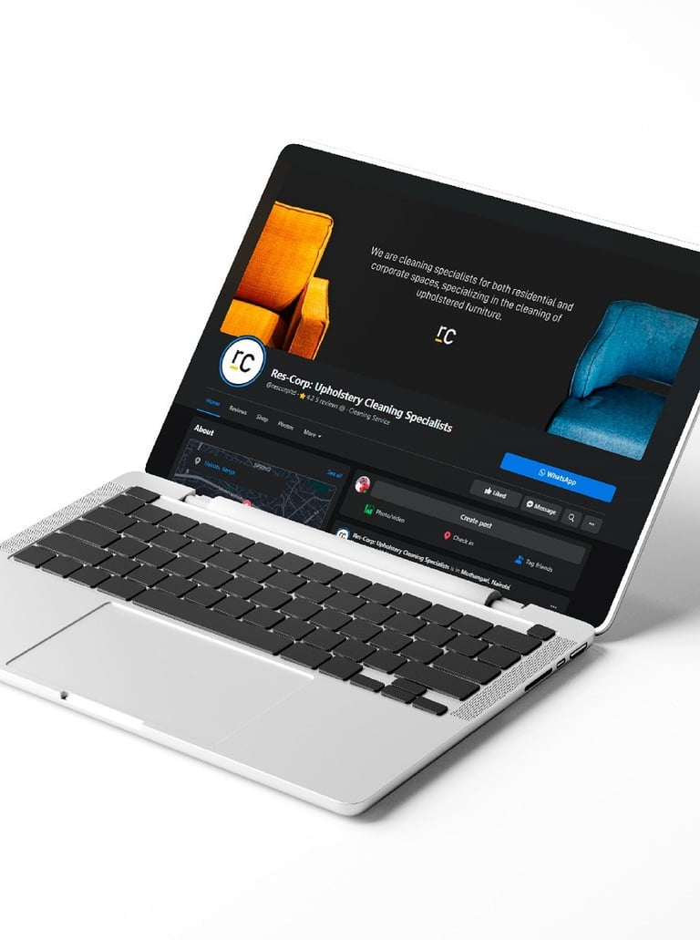
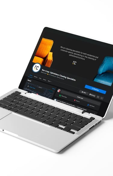
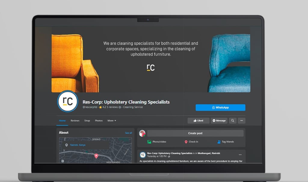
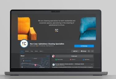
→ Social Media Banners
The Problem
The Solution
RESCORP's previous brand identity, characterized by a red and blue palette and a nondescript logo, failed to resonate with the company's ethos and the high-quality services they provided. The existing brand touchpoints, from business cards to service vehicles, lacked cohesion and sophistication, resulting in a company image that did not reflect the premium nature of their services.
This misalignment led to insufficient market awareness and a brand perception that didn't command the value they delivered. Clients often failed to see the distinction between RESCORP and its competitors, leading to unnecessary price negotiations and underappreciation of the specialized service offering.
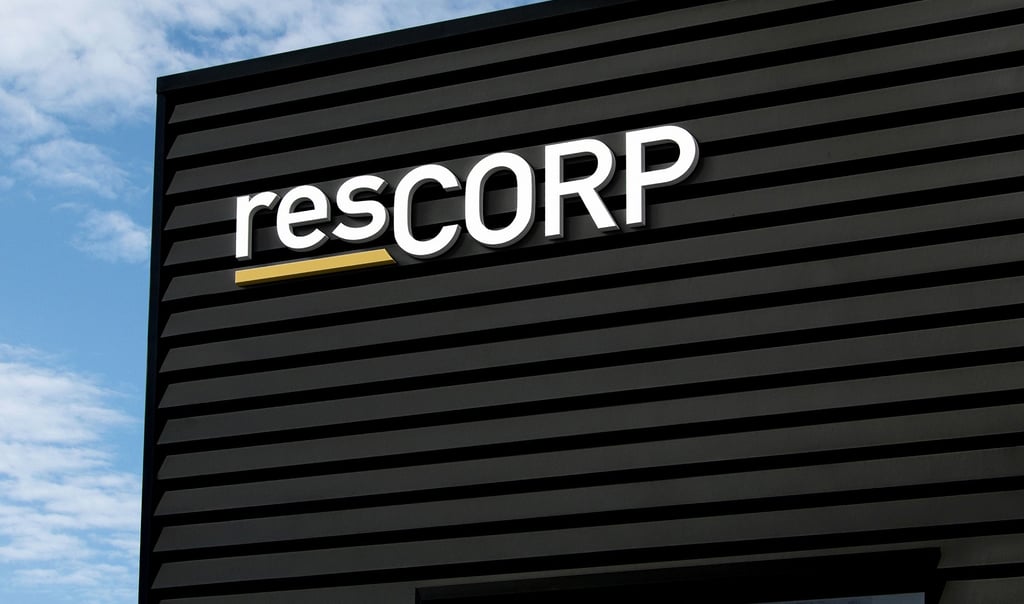
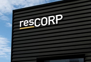
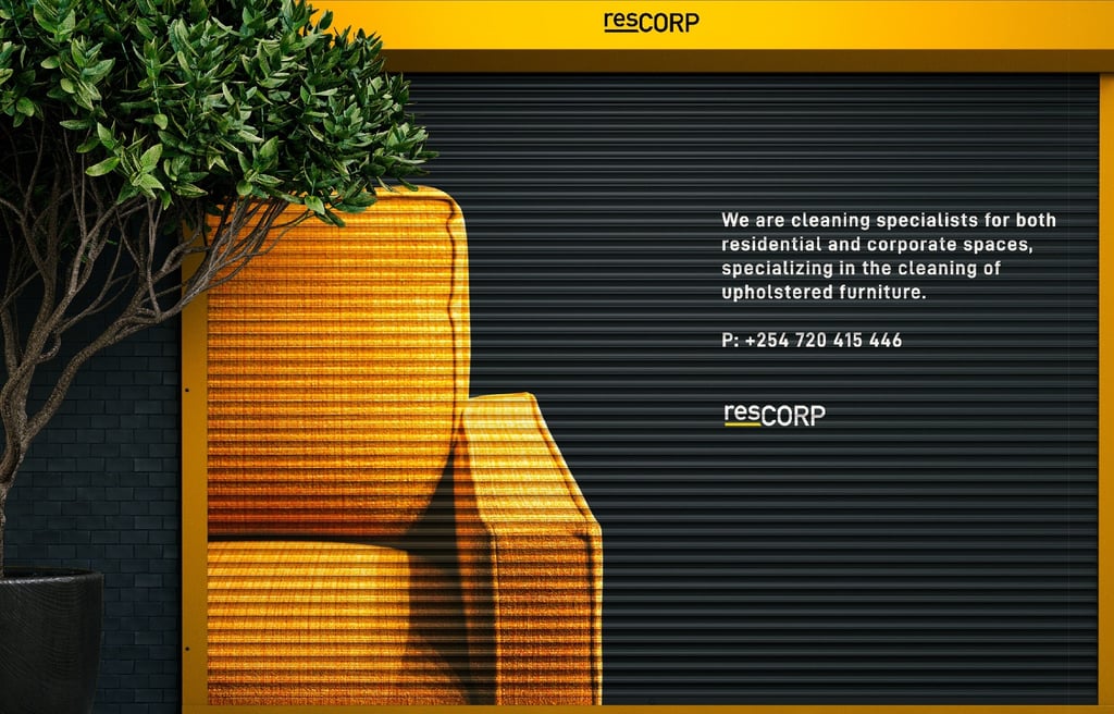
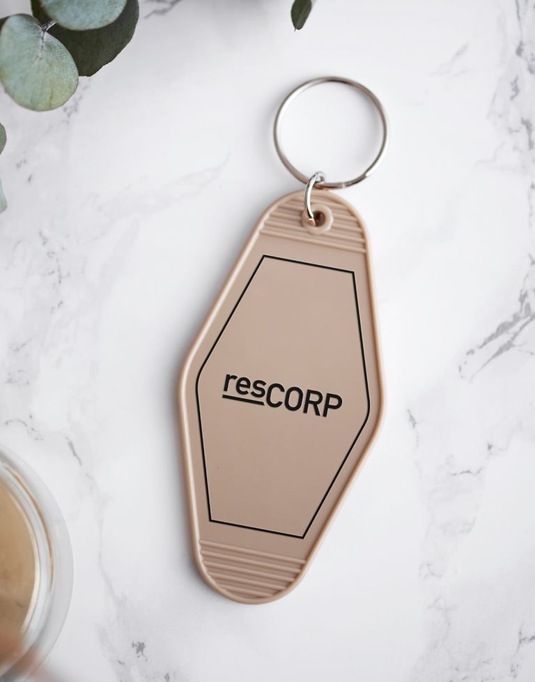
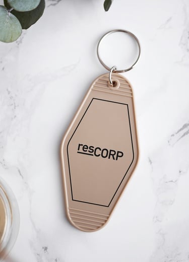
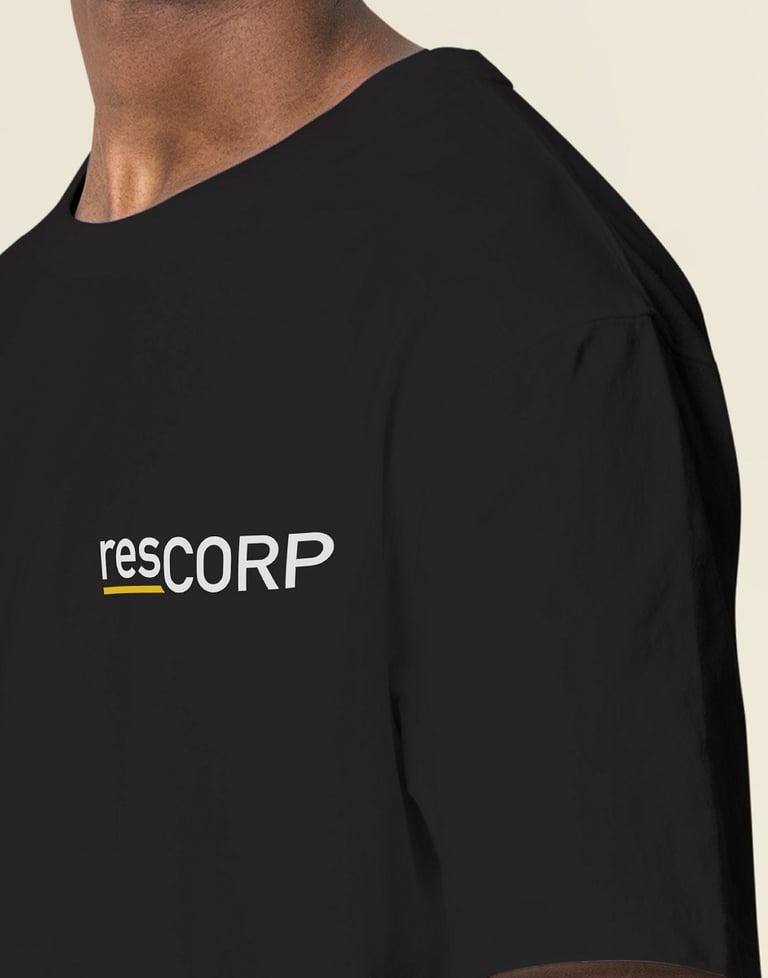
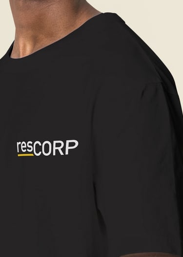
We overhauled RESCORP's visual identity to embody the quality and professionalism at the core of their business. The red and blue were replaced with a sleek grey and vibrant yellow, invoking a sense of enthusiasm balanced with a corporate ethos. The redesigned logo, a word-mark that encapsulates the brand's commitment to excellence, uses typography to convey RESCORP's adaptability and expertise in both residential and corporate sectors.
By raising 'res' and capitalizing 'CORP', we created a visual nod to their dedication to raising the standard of living and working environments. Implementing this new identity across all brand touchpoints has significantly refined RESCORP's professional image, aligned with their value proposition, and enhanced their market presence.
The reimagined touchpoints now effectively communicate the brand's essence, from the first impression to the lasting impact of their services.