Nokia's Rebrand
Was Nokia Rebranding A Masterstroke or a Misstep?
Nokia's Rebrand
To lovers of Snake and the iconic Nokia 3210, Nokia has rebranded.
When Nokia announced a rebrand in Feb 2023, it was met with mixed reactions. They were moving away from their traditional 50+-year-old blue logo and rigid phone-making brand identity - to something new. Something very versatile - well according to them.
Nokia had been sold to Microsoft in 2016 and Microsoft didn’t know what to do with the brand, losing about 8 billion in the process. They later sold it to HMD Global, former employees of Nokia. And the new owners don’t want to be known just as a phone company - instead, they want to be known as "pioneers of digital transformation". a business technology company.
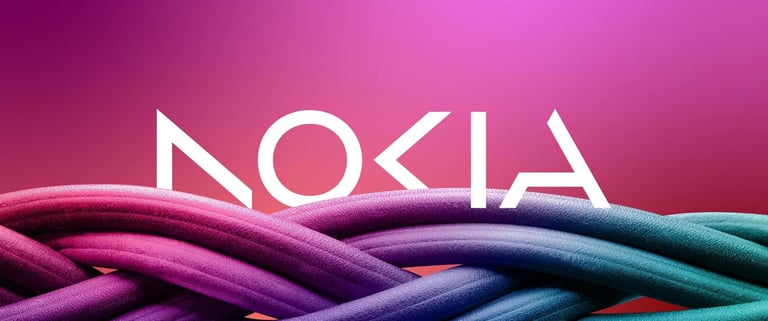
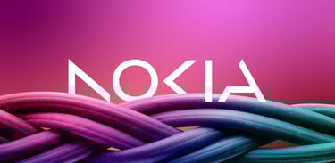
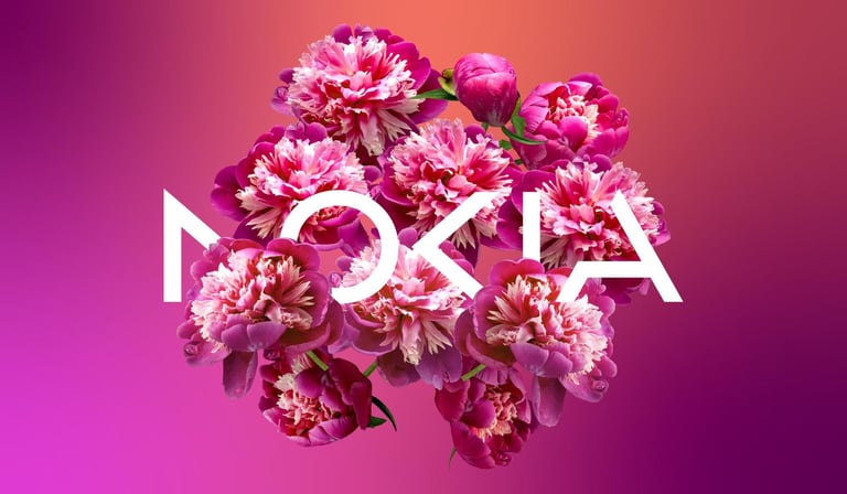
Their brand colors are more vibrant, moving away from navy blue. The shift in brand colors towards vibrant gradients is a clear sign of Nokia's intention to move beyond its phone-making roots and explore more innovative avenues. I believe that such a rebranding initiative is a good move that will ensure Nokia's continued relevance and success in the fast-paced business landscape. After all, we are talking about Nokia again!
In his blog post, CEO Pekka Lundmark succinctly encapsulated Nokia's updated strategy and brand identity, stating, "We are a business-to-business technology innovation leader pioneering the future where networks meet cloud." Revamping the Nokia logo design, utilizing shared strokes, changing brand fonts, and using vibrant colors is, for sure, a masterstroke that emphasizes their innovative edge and commitment to futurism.
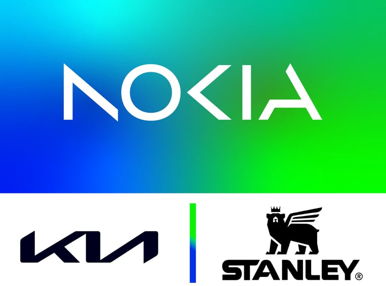
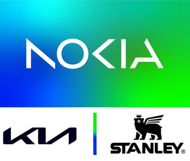
Did they steal from KIA? No.
Did they steal from us? Yes! We have just lost a bit of our sentimental history.
Takeaways:
When doing a logo design - readability is more important than creativity.
It is okay to rebrand when the brand doesn’t agree with the vision you bear.
Wishing you the best!
The logo is still in a sans-serif font, but more slender and future looking - and reminiscent of the new KIA logo that sacrificed readability at the altar of creativity, according to some. The KIA rebrand caused 30,000 monthly Google searches on the “KN logo” in 2022. As for Nokia, they have removed bits of the NOKIA letters to create the logo and netizens have dropped their comments asking if it is to be read as AOCIA, AOKIA, NOCIA, or NOKIA.
The effect used in the logo design is shared strokes. This is where the letter N and K have been cut short and O has been used as a base. It is a very common style in logo design found in logos such as KIA and Stanley. And it is an old approach to futurism found even in alien Sci-FI movies. And I agree with the creative agency that executed on that front. Given the letters of the NOKIA name, the only letters that could share strokes are N, O, and K. However, a better logo would be shared strokes on O and K only.
We simplify brand building for those starting, growing, or changing direction.
You will receive all our thinking straight to your email.